Sneak Peek: The Lock and Key

...NEWSFLASH...

A month or so back there was a crazy-huge development in my little life:  I was launched into space and OVER THE MOON!  So if anyone has reported me missing, look over the moon - you'll find me there!

What's she babbling about now, you may ask.  I'll tell you: my big news is the wonderful opportunity I've been given to be a Contributor/Blogger for Mixed Up Magazine's new blog!  I can't even begin to tell you how exciting this is for me to be working with Katy Leitch and her incredible team of artists. I am so thrilled and honored and, yes, over the moon!

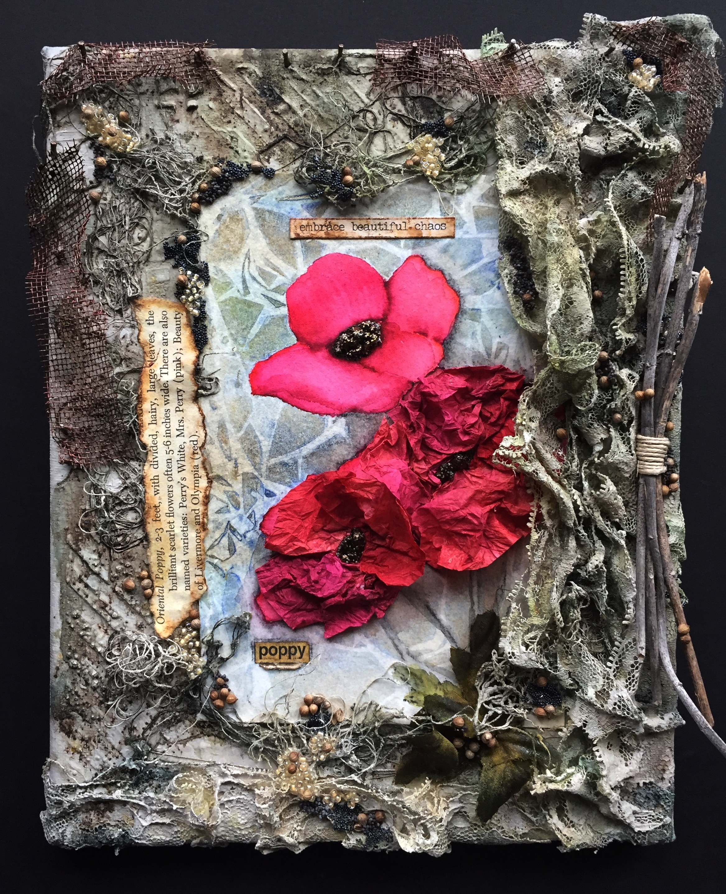
To see my post, additional photos and a tutorial for The Lock and Key, head on over to the fabulous and fun blog at Mixed Up Magazine.

See you there!

Leslie

An Evening in Tuscany

Buongiorno!

I have a great travel companion - my imagination - and today we are going to Italy!

FullSizeRender-43.jpg

I was getting ready to make a housewarming gift for my daughter when I saw that the March Challenge for the Fabrika Decoru Blogspot  was Italian Mood.  I decided this would be a perfect theme for a bit of decor for my daughter's new home. During a 'supply mission'  to my local thrift store, I came across a broken olive wood serving tray.  I immediately envisioned that it could become a window overlooking a Tuscan vineyard.

The first step to this 'conversion' was to create the faux stone walls.  I tore pieces of cardboard and glued them onto the tray, leaving open areas in between for my 'mortar'.  Texture was applied next with Fabrika Decoru Paste (which has wonderful little marble particles in it) followed by the initial coat of stone color.  The inner frame work of the window was gessoed and treated with Prima's White Crackle paste.

Once the crackle paste had dried overnight, I was ready to add color to the inner frame of the window. I lightly painted a mix of brown, copper and cream and then applied DecoArt Media Antiquing Cream which was rubbed back and gently buffed with a soft cloth.  

Next, I began working on my embellishments.  I had been given a mini champagne bottle to alter which was the perfect size to place on my 'window sill'.  However, the label was all wrong -   I needed an Italian wine label, of course. So, to lend authenticity to the theme, my husband and I shared a bottle of Montepulciano D'Abruzzo.  Such are the struggles of the creative process...

I removed the champagne label, adhered the red wine label and then applied tissue paper, crackle paste and a few micro stones to the bottle.  Twine and braiding were also added.  The vibrant color on the bottle, grapes and flowers was achieved by combining Fabrika Decoru paint and sprays and highlighting with the new Art Alchemy wax in Rose Gold.

The backdrop was done on wet watercolor paper using Fabrika Decoru for the sunset sky and a mix of Paper Artsy Infusions and Dr. Ph Martin's Bombay ink for the rolling hills.  I tore 'hill-shapes' from the paper and layered them against the sky for a feeling of distance.  This backdrop was then adhered to a foamboard before securing behind the window frame.

I cut a wine cork into circles using a serrated knife and glued wood letters to spell 'Italy'.  This was glued onto my piece along with the other prepared embellishments using Prima's 3D Gloss Gel.  The final touch were the vines which I gathered outside my own front door where they grow on the stone of our house (5,375 miles away from Italy).

Thank you for joining me in 'Tuscany' this evening. 

Arrivederci!

Leslie 

Product List

Fabrika Decoru:  'Aventurine' Chameleon Spray, 'Chocolate with Bronze' Metallic Spray; Metallic Paints in 'Brass', 'Olive' and 'Blackberry'; White Texture Paste with Marble Particles

DecoArt:  Acrylic paint in "Antique Gold', 'Warm White', 'Grey Storm' and 'Desert Sand'; Antiquing Cream in 'Raw Umber' and 'Green Patina'

Prima:  Art Basics Modeling Paste and 3D Gloss Gel; Art Alchemy Métallique Wax in 'Rose Gold' and 'Bronze Age';  Art Extravagance White Crackle Paste; Art Ingredients 'Copper' Micro Beads

Paper Artsy:  Infusions in 'The Sage'

Dr. Ph Martin's Bombay Ink:  'Grass Green' and 'Sepia'

Folk Art Acrylic Paint:  'Pink Flash'

Miscellaneous:  Gesso, broken olive wood serving tray, masking tape, cardboard, foamboard, watercolor paper, small bottle, tissue paper, wine label, wine cork, wood letters, twine, braiding, glass grapes, silk flowers and vine pieces

I was inspired to create this piece after seeing the theme and colors for the March Challenge at Fabrika Decoru.  


Ice Melt


March, when days are getting long,
Let thy growing hours be strong
To set right some wintry wrong.
~Caroline May, 1887

March, a fickle beast.  Ice, Ice Everywhere and snow.  You know the product that you scatter on your sidewalks for quick-melting dangerous ice to lessen the risk of falling and breaking the majority of bones in your body?  Well it occurred to me we could load that stuff up in crop dusters and spray the city with it!  My husband warned me not to take that idea to City Hall!  Can you believe that!?   I have the answer to hazardous driving conditions and he just shakes his head and mutters something about 'acid rain'. 

                Attention:  I am actually going to lock my silly-self in the closet for a moment and be serious, for I have some news to share:  I have been chosen to be a Design Team member for Mixed Media World.  I am very much looking forward to creating with a wonderful group of talented people.

My introductory piece, Ice Melt, is for the Mixed Media World March Challenge. I created this altered bottle, Ice Melt, to celebrate the coming of Spring, incorporating the theme and colors in the moodboard - melting ice, renewal, blue sky and sunlight.

In this spirit of renewal, I have altered an orange Halloween glass bottle!   The first step was to coat the glass surface in black gesso.  When the gesso was dry, it was time to 'get cracking': I applied a heavy layer of Prima's Art Basics White Texture Crackle to the upper part of the bottle and allowed it to dry overnight.  Few people have ever described me as a 'patient person', but I cannot stress enough how much patience is important with achieving a good crackle texture.

The next morning, I was ready to add another layer in the form of lace.  I was just gifted a box of gorgeous vintage lace from a wonderful lady named Susan.  I chose several beautiful pieces that seemed perfect for my theme: the 'melting droplets' of lace on the top of the bottle stopper, the 'icicles' at the base of the bottle neck, the 'blooming spring flowers' wrapped around the center of the bottle and the last 'snowdrifts' of lace just above the diamond pattern.

I built upon my lace layer by adhering string, cheesecloth, art stones and stung beads followed by wood embellishments of a butterfly and a decorative scroll motif.  I chose a heart charm out of my stash and a chain to create the locket embellishment on the bottle stopper.  I applied a coat of white gesso to the entire bottle except the crackled areas and then painted over that with DecoArt's Chalky Finish in 'Revive'.

The 'icy' color was achieved by spraying several different shades of blue, gray and beige and finishing with Tattered Angels "Dazzling Diamonds" Glimmer Mist. I dry-brushed white gesso to soften the look.

While the sprays were drying, I made the handmade flowers from old book pages.  I am an avid reader and there is an event in my town each year that sells used books.  The proceeds go toward university scholarships for women.  I always attend the first day to gather the books I want to read, and the last day to rescue books that will go to the landfill (GASP) if not sold.  These are the 'death-row' books and pages that I repurpose in my art.  So, back to the subject at hand, I began with the old book pages and flower punches in two different sizes.  The large flowers have eight layers and the small, six.  I dyed the edges with distress ink and then secured the layers together with a brad through the center. I allowed the flowers to dry overnight before adding them and a brass key to the bottle as the finishing touch.


Product List

Prima:  Art Extravagance White Crackle Paste; Art Basics 3D Gloss Gel; Art Stones & Mini Art Stones; Color Bloom "Chrome" Spray Mist

Lindy's Stamp Gang Starburst Spray:  "Creme Brûlée Creme", "Clam Bake Beige", "Down the Rabbit Hole", "Frozen Jack Frost" and "Whale Watch Blue"

Shimmerz Coloringz:  "A Shade of Gray"

Tattered Angels:  "Dazzling Diamonds" Glimmer Mist

Ranger:  Distress Inks "Faded Jeans" and "Tea Dye"

DecoArt: Chalky Finish Acrylic Paint in "Revive"

Black Gesso, White Gesso, Lace, String, Cheesecloth, Bead strand, book pages, flower punches, brads, wood embellishments, heart charm, chain

Eye Of The Beholder


It’s true that beauty is in the eye of the beholder.
— Margaret Wolfe Hungerford, 1878
It is only with the heart that one can see clearly, for the most essential things are invisible to the eye.
— Hans Christian Andersen, The Ugly Duckling

The other day I came across a picture of a Brahmaea Wallichii.  What's a Brahmaea Wallichii you ask? Why it's a beautiful moth typically found in parts of Asia.  According to the article, it does not fly away when disturbed, but shakes fiercely...much like myself when bothered before my morning coffee.  The distinctive 'eye spots' on its wings are striking as are all its intricate markings.  It's like a flying Zendoodle!  

Now you know the belle of the ball in the insect world is the glamorous butterfly, gliding on a gentle breeze and flitting gracefully among flowers .... rather than beating herself against a lightbulb like our lowly friend, the moth.  Maybe the allure of the nocturnal lightbulb is the moth's attempt to be in the spotlight for once, instead of hiding out in the shadows while the butterfly wows the crowd.  

So, without further ado, here is my latest canvas in which I showcase a moth, for beauty is in the eye of the beholder.


I began by constructing my moth.  Having no experience in moth making, I decided to make a template which I used as a pattern to cut the cardboard. I made a mirrored sketch from one wing to the other and used embossing powder over the pencil lines.  Before I began painting the moth's patterned wings with acrylic, I scrunched some paper scraps and glued these around the wing edges.  The moth's body is also made out of cardboard, but I added some cut up yarn to black paint for a fuzzy appearance.  My two finishing touches were melange discs over the wing eyespots and the antennae made from tiny springs.

IMG_4037.JPG

Moving on to the canvas, I coated the entire inverted surface in black gesso followed by modeling  paste through stencils for the initial texture layer.  The second layer consisted of crumpled tissue paper, string, thick felt circles and more stenciling.  Another coat of black gesso was applied (I really need to buy stock in gesso).  Layer three of texture included the corner floral section, mélange discs in various sizes and art stones.  Anybody care to guess what came next?  That's right!  Black gesso!  


Now for some color, albeit dark color:  black, blue and brown were my choices for the nocturnal background.  However, I also wanted a strong contrast to bring attention to the moth,  so the fourth and final layer was done in light tones.  This montage in the center was composed of twisted paper rolls, inked scrapbook paper, punched paper, a disassembled wooden birdcage and dyed cheesecloth.  I splattered a bit of white paint and sprayed some Lindy's "Whale Watch Blue" before adding my moth to the middle.


More dyed cheesecloth and bronze micro beads were added here and there followed by the final embellishments:  a lightbulb, magnifying glass, the domed word 'moth' and the phrase 'Beauty is in the eye of the beholder.'

Smiles!

Leslie

So, I'll be honest, I created this piece after I saw the challenge at More Than Words to create an entry with the prompts Beautiful and Butterfly.  I'd like to enter my piece in that challenge fully knowing I'm bending the rules a bit....However, butterflies and moths ARE from the same family, Lepidoptera ;)  

Go Underdog!

Also, I've just discovered the fun-tastic moodboards at DeeDee Catron's Our Mixed Media Moods.  Their latest board was a great nocturnal inspiration for my project.

And lastly, my favorite little steampunk corner, SanDee & Amelie's. I know my moth with his spring antennae will feel so at home there.


Product List

Prima:  Art Basics Modeling Paste and 3D Gloss Gel; Art Alchemy Métallique Acylic Paint "Steampunk Copper"; Art Ingredients "Bronze" Microbeads and Mélange; Art Extravagance Art Stones and Mini Art Stones; "Cherish" Stencil

Tattered Angels:  Bare Metal "Weathered Copper" Naturally Aged Paint System  

Lindy's Stamp Gang Starburst Sprays:  "Whale Watch Blue", "Frozen Jack Frost"

DecoArt:  Dazzling Metallics Acrylic Paint in "Worn Penny", "Champagne Gold" and "White Pearl"

Folk Art Metallic Acrylic Paint:  "Sequin Black", Color Shift "Black Flash", Brushed Metal "Brushed Gold"

Ranger:  Dylusions "Black Diamond" Stencil; Distress Ink in "Black Soot", "Walnut Stain" and "Vintage Photo"

TCW:  "Mini Netting" Stencil

Weldbond

16" x 8" canvas, white and black gesso, tissue paper, string, felt pads, artificial flowers, cheesecloth, patterned paper, cardboard, tiny hole punch, magnifying glass, wooden birdcage, springs and lightbulb.