My Mom always made sure poppies bloomed in our backyard, for they were in remembrance of her father, my grandfather, who fought in World War I. I miss seeing their vibrant blooms, standing out so proudly in the shade of the apple trees. Why have I not cultivated them in my own backyard? I vow to make this happen. And in the meantime, I would like to share with you "Field Poppies".
Before I became hopelessly diagnosed with an extreme case of Mixed Media Syndrome, one of my many art explorations was watercolour. Given that the April challenge prompt for Mixed Media World is 'watercolour', I dragged out my supplies and got to work.
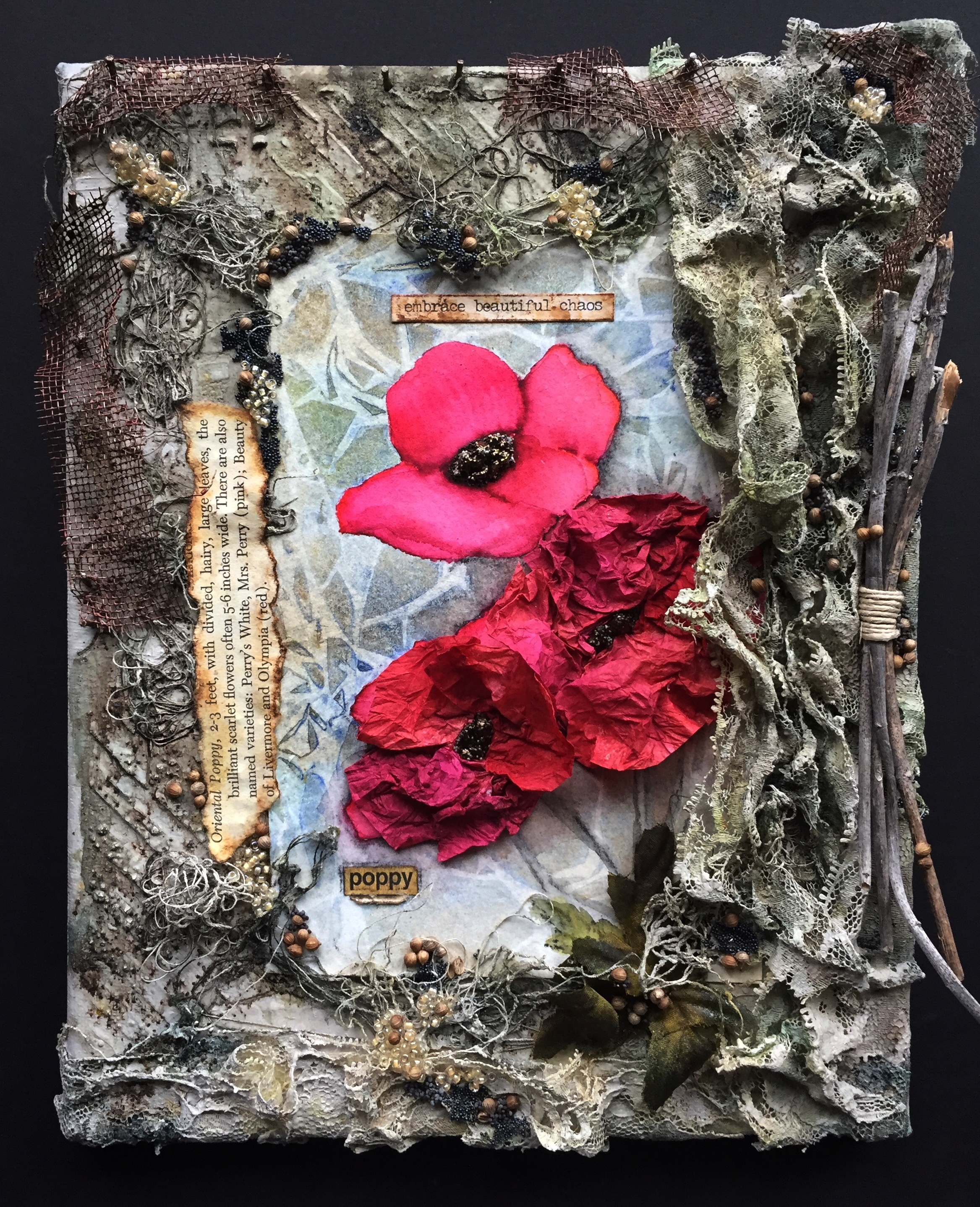
I began with strips of masking tape on a cutting surface and roughly sketched out my poppies. I cut around my sketch with an exacto knife and positioned the mask on cold pressed watercolour paper.

After a wash of salt water, I laid down some Qor watercolours with a bit of sap green in the Windsor Newton line. I quickly pressed a sheet of crumpled plastic wrap to the surface and set it aside to dry. This is a simple technique for interesting watercolour backgrounds. Upon drying, I removed the plastic wrap to reveal my 'fractured' base. The poppy mask was then taken off and I was all set for the next step.

There are several ways to achieve a watercolour effect, so rather than painting the poppies in my Qor watercolour paint, I decided to use my Tombow markers. Choosing several different shades, I outlined my design and began 'pulling' the colors across the petals with a wet brush. Each petal was worked separately and allowed to dry before beginning an adjacent petal. After drying, my project morphed into Mixed Media when I created the centers of the poppies out of 3D Gloss Gel, Mini Art Stones, Ink and Embossing Powder.

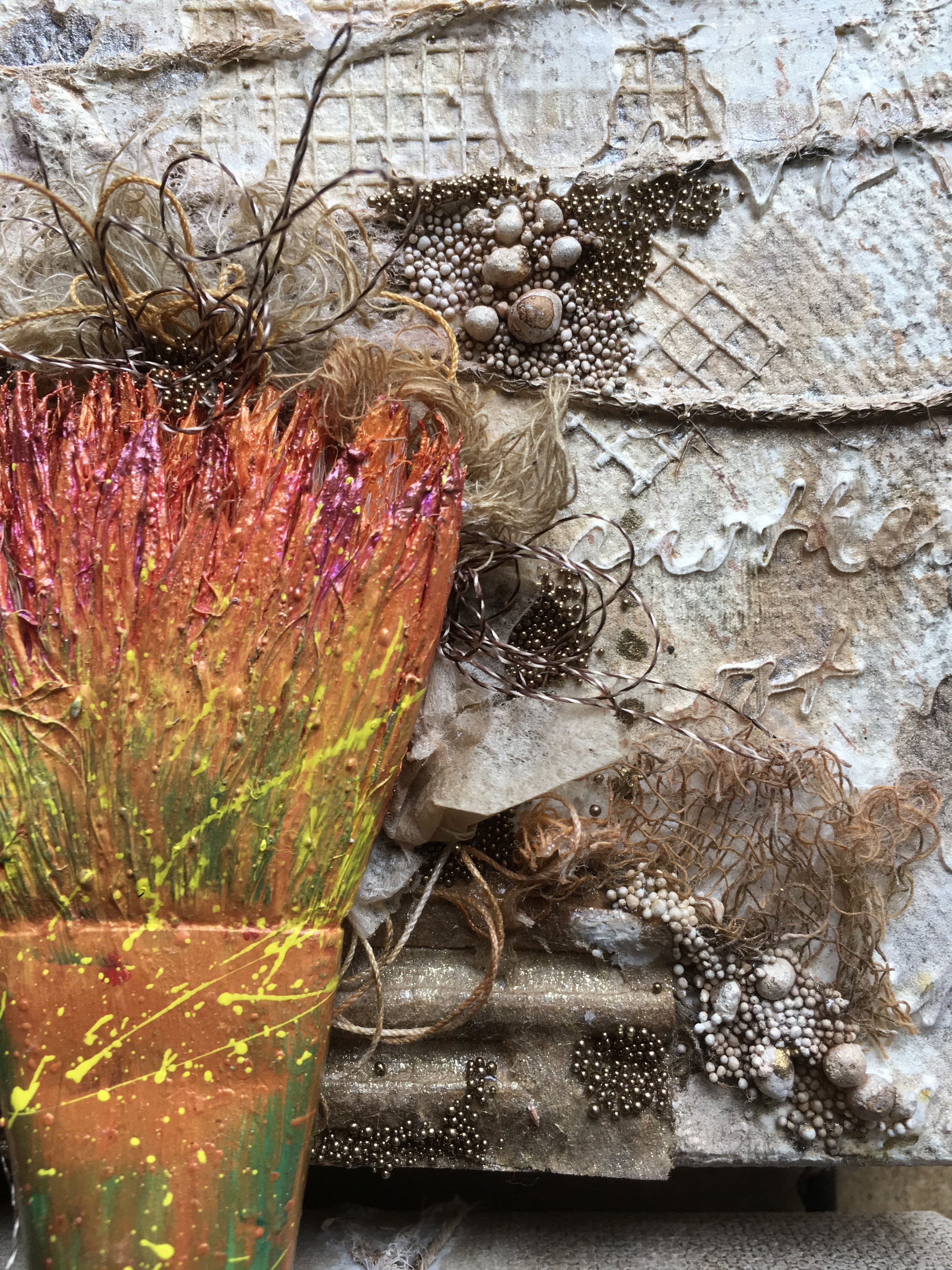
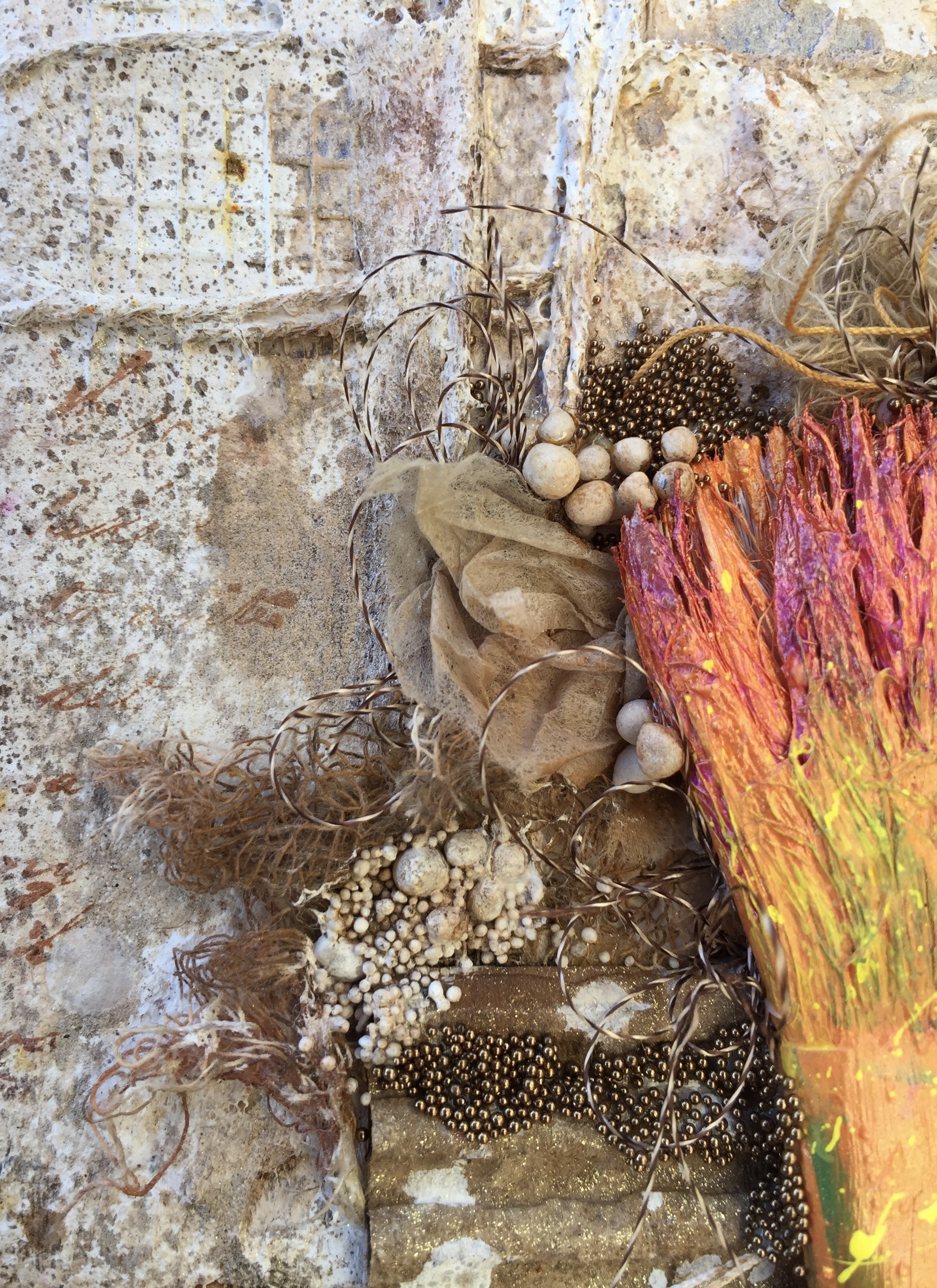
Next, I gessoed and stenciled a pattern onto an 8 x 10 canvas. More texture followed in the form of old lace and thread. Before adding my poppies watercolour, I added my muted green background to contrast with the color pop of the flowers.

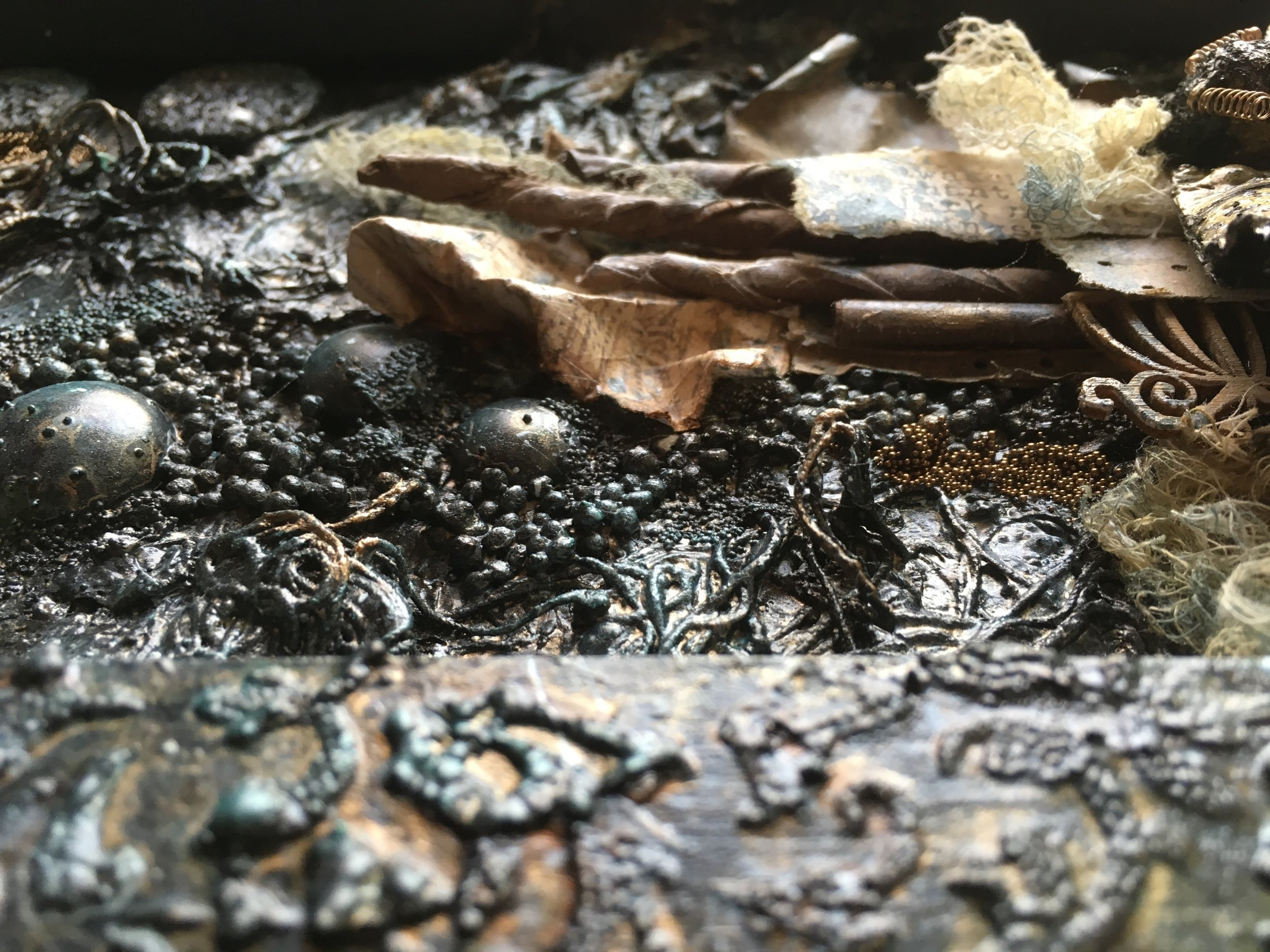
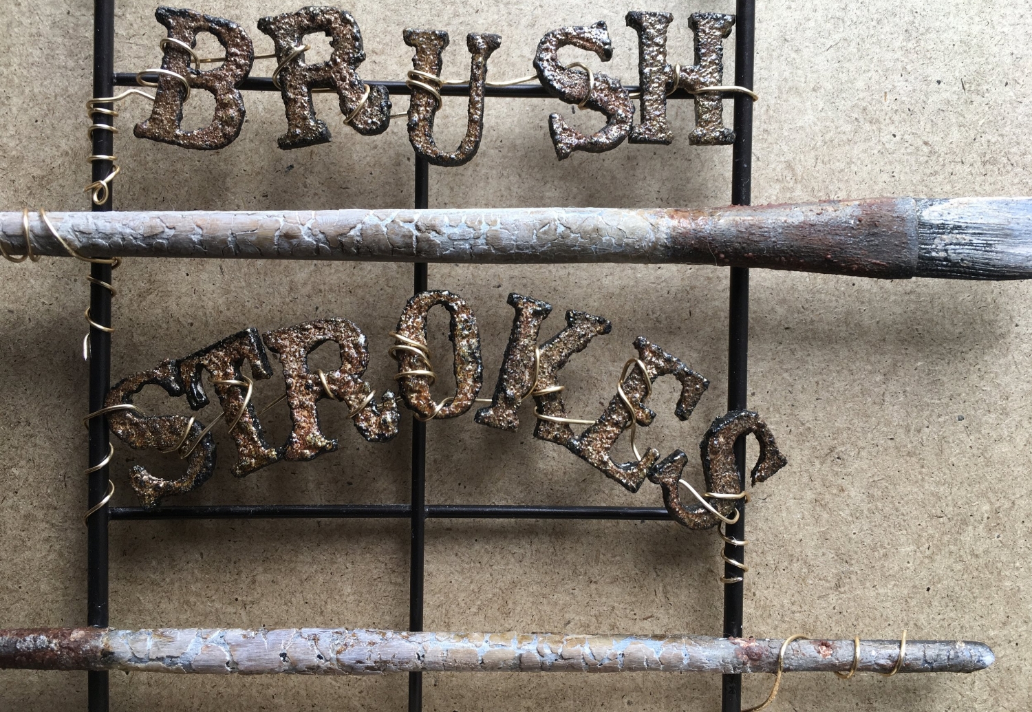
Once the watercolour painting was adhered to the canvas, I began gluing the embellishments: seeds, beads, painted screen, sticks and the wording pieces. As a final touch, I sprayed tissue paper with color and made petals for the foreground flowers. How fun to introduce my watercolour paints to my mixed media supplies! I'm sure they'll get together again soon.


Have a wonderful bloom-filled day and join the creative fun at Mixed Media World!
Leslie
Product List
Qor Watercolour Paint: 'Burnt Sienna', 'Quinacridone Gold Deep', 'Viridian Green', 'Ultramarine Blue'
Windsor Newton Watercolour Paint: 'Sap Green'
Arches: Cold Pressed Watercolour paper, 140 lb
Tombow Markets: 837, 845, 847, 885, 905
Prima: Art Basics Modeling Paste, 3D Gloss Gel; Art Ingredients Micro Beads Black
Paper Artsy: Infusions 'The Sage'
Deco Art: Chalky Finish Acrylic Paint 'Primitive'
Folk Art: Acrylic paint in 'Brushed Metal Bronze' and Antique Metallic Copper
Lindy's Stamp Gang: Starburst Sprays in 'Ponderosa Pines Olive', 'Rusty Lantern Lime', 'Frozen Jack Frost', 'Autumn Maple Crimson', 'Bougainvillea Fuchsia', 'Burnt Umber'
Ranger: Distress Stain in 'Vintage Photo'; Tim Holtz Idea-ology 'Small Talk'; Dylusions Square Stencil
Miscellaneous: 8 x 10 canvas, white gesso, Silver Black Velvet #8 watercolour brush, watercolour wash brush, cling wrap, tissue paper, masking tape, nails, diagonal lines stencil, old lace, beads, thread, hemp, poppy seeds, coriander seeds, screen, flower book page, sticks